PAUSE — Coffee & Bulochki
PAUSE — Coffee & Bulochki
Full brand identity — naming, logo, color system, packaging and menu design — for a coffee shop opening from absolute zero, built to feel like a deliberate pause from the city's rhythm.
Branding & identity
Graphic design
Learn More
Inspired by the idea of a deliberate pause in a fast-moving city, this identity turns a single visual joke — a bird mid-sip — into a full, cohesive brand system, down to the punch card.
Darya Kuznetsova — Founder, PAUSE
"We were opening a coffee shop with a name, a location, and nothing else — no logo, no colors, not even a menu format. Nikel Digital Studio gave us a full identity before we poured our first cup, and today people recognize our cups from across the street."
Problem
Most independent coffee shops open with real product and real ambition but nothing else to build a brand on — while competing in a city where "just another cozy café" is the default on every block.
Without a distinct identity locked down before opening day, a new coffee shop either blends into the same reclaimed-wood-and-Instagram-plant look as everyone else, or launches with a mismatched, ad-hoc set of signage, cups and menus that undercuts the experience the space is trying to sell. PAUSE was exactly this case: a name, a location, and literally nothing else before we started.
Solution
A full identity built from zero, applied everywhere a customer actually touches the brand — not just a logo.
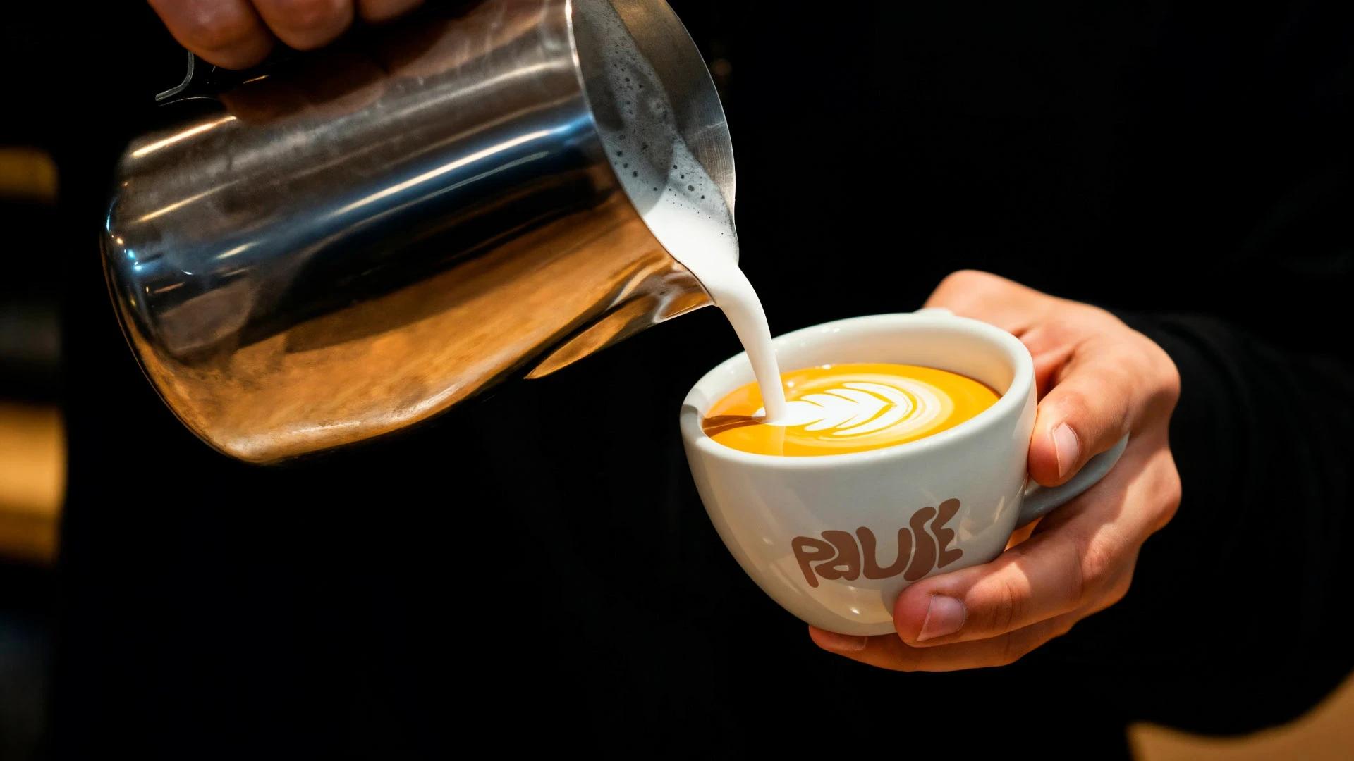
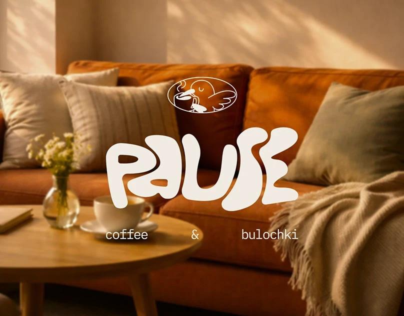
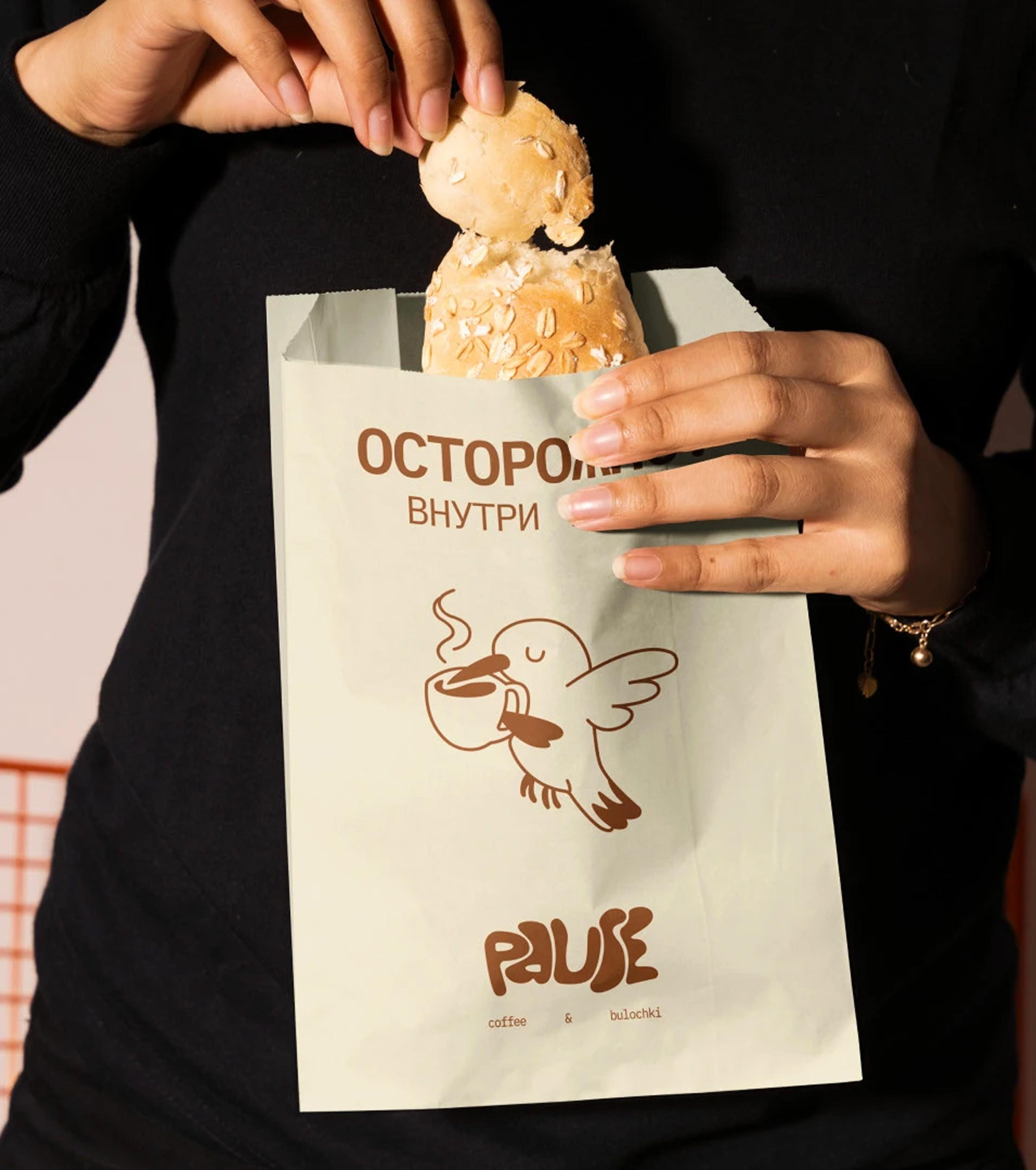
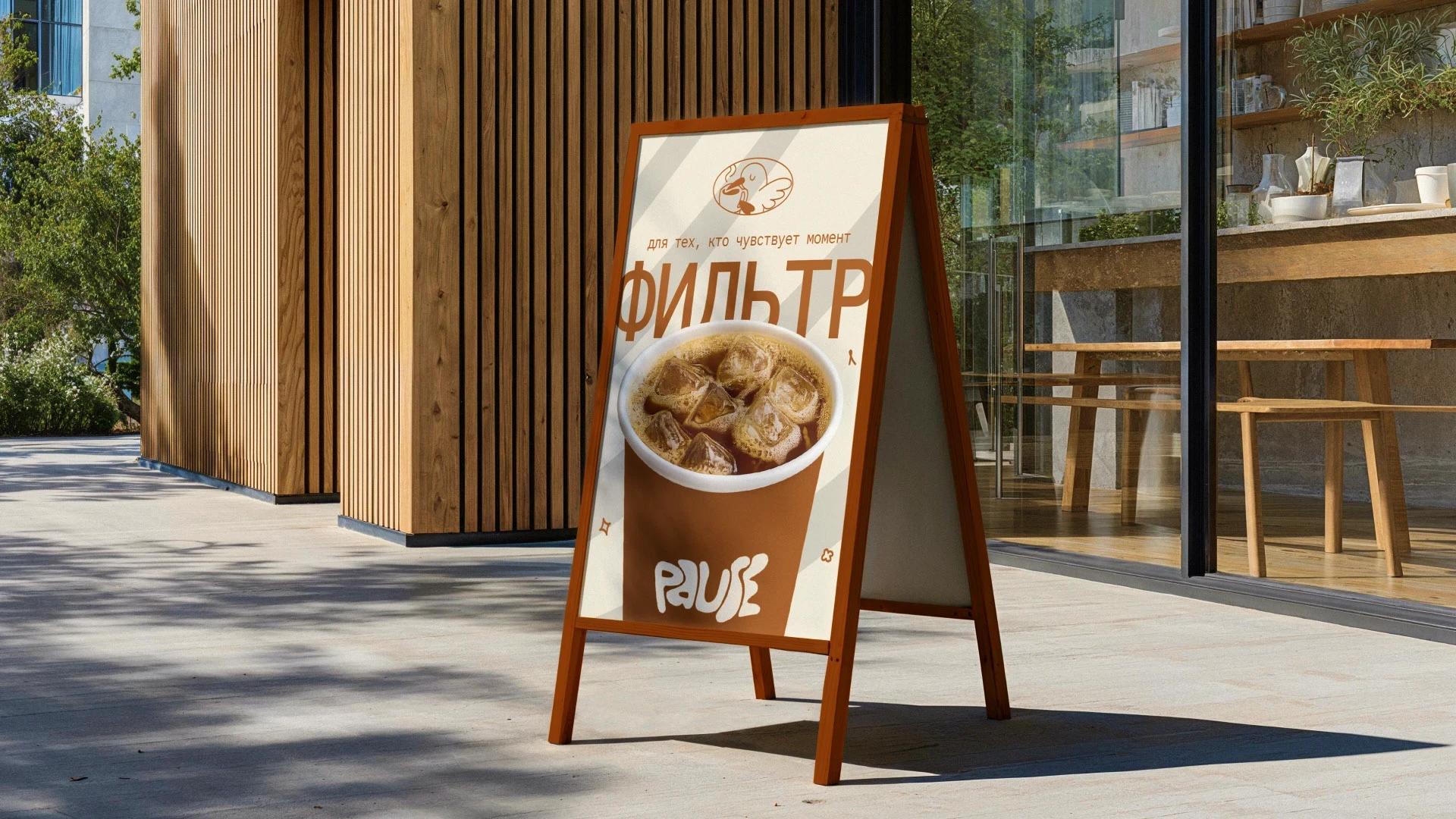
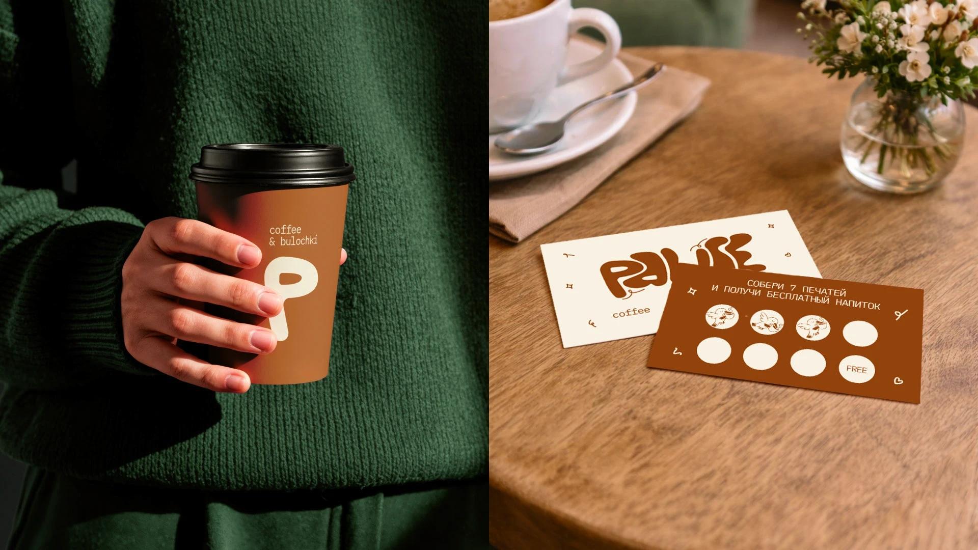
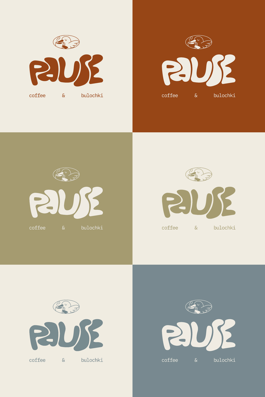
We built the identity starting with the name itself — PAUSE, positioned as "coffee & bulochki," a deliberate break from the city's rhythm — then a custom, rounded wordmark with a bird-and-coffee-cup emblem, and a four-color palette where every color carries a specific meaning: terracotta for warmth and coffee, ivory for air and light, blue-grey for urban calm, olive for nature and stillness. That system was then applied to cup design, street A-frame signage, a full menu with named signature drinks (Пауза, Нектар, Полёт, Тепло, Клён), and a loyalty punch card built around the bird mark — plus direction of the food and lifestyle photography (croissants, latte art, real customers with laptops and dogs), so the brand had a consistent visual world from day one.
Results
A brand identity that turned first-time visitors into loyalty-card regulars within weeks of opening.
Since opening with the new identity, PAUSE reached 85%+ loyalty card enrollment among repeat customers within the first two months, the signature "Pause" drink now accounts for roughly 1 in 4 drink orders, and the branded cups and interior drove organic social mentions well beyond what a venue of its size would typically generate — turning the shop into a recognizable local spot within weeks of opening.
Where AI helped
Concept exploration — Dozens of logo and palette directions were explored with AI-assisted concept generation in days rather than weeks, then narrowed down and hand-finished by our designers into the bird-and-coffee mark PAUSE uses today.
More Works
(GQ® — 02)
©2026
PAUSE — Coffee & Bulochki
Full brand identity — naming, logo, color system, packaging and menu design — for a coffee shop opening from absolute zero, built to feel like a deliberate pause from the city's rhythm.
Branding & identity
Graphic design
Learn More
Inspired by the idea of a deliberate pause in a fast-moving city, this identity turns a single visual joke — a bird mid-sip — into a full, cohesive brand system, down to the punch card.
Darya Kuznetsova — Founder, PAUSE
"We were opening a coffee shop with a name, a location, and nothing else — no logo, no colors, not even a menu format. Nikel Digital Studio gave us a full identity before we poured our first cup, and today people recognize our cups from across the street."
Problem
Most independent coffee shops open with real product and real ambition but nothing else to build a brand on — while competing in a city where "just another cozy café" is the default on every block.
Without a distinct identity locked down before opening day, a new coffee shop either blends into the same reclaimed-wood-and-Instagram-plant look as everyone else, or launches with a mismatched, ad-hoc set of signage, cups and menus that undercuts the experience the space is trying to sell. PAUSE was exactly this case: a name, a location, and literally nothing else before we started.
Solution
A full identity built from zero, applied everywhere a customer actually touches the brand — not just a logo.
We built the identity starting with the name itself — PAUSE, positioned as "coffee & bulochki," a deliberate break from the city's rhythm — then a custom, rounded wordmark with a bird-and-coffee-cup emblem, and a four-color palette where every color carries a specific meaning: terracotta for warmth and coffee, ivory for air and light, blue-grey for urban calm, olive for nature and stillness. That system was then applied to cup design, street A-frame signage, a full menu with named signature drinks (Пауза, Нектар, Полёт, Тепло, Клён), and a loyalty punch card built around the bird mark — plus direction of the food and lifestyle photography (croissants, latte art, real customers with laptops and dogs), so the brand had a consistent visual world from day one.
Results
A brand identity that turned first-time visitors into loyalty-card regulars within weeks of opening.
Since opening with the new identity, PAUSE reached 85%+ loyalty card enrollment among repeat customers within the first two months, the signature "Pause" drink now accounts for roughly 1 in 4 drink orders, and the branded cups and interior drove organic social mentions well beyond what a venue of its size would typically generate — turning the shop into a recognizable local spot within weeks of opening.
Where AI helped
Concept exploration — Dozens of logo and palette directions were explored with AI-assisted concept generation in days rather than weeks, then narrowed down and hand-finished by our designers into the bird-and-coffee mark PAUSE uses today.
More Works
(GQ® — 02)
©2026
PAUSE — Coffee & Bulochki
Full brand identity — naming, logo, color system, packaging and menu design — for a coffee shop opening from absolute zero, built to feel like a deliberate pause from the city's rhythm.
Branding & identity
Graphic design
Learn More
Inspired by the idea of a deliberate pause in a fast-moving city, this identity turns a single visual joke — a bird mid-sip — into a full, cohesive brand system, down to the punch card.
Darya Kuznetsova — Founder, PAUSE
"We were opening a coffee shop with a name, a location, and nothing else — no logo, no colors, not even a menu format. Nikel Digital Studio gave us a full identity before we poured our first cup, and today people recognize our cups from across the street."
Problem
Most independent coffee shops open with real product and real ambition but nothing else to build a brand on — while competing in a city where "just another cozy café" is the default on every block.
Without a distinct identity locked down before opening day, a new coffee shop either blends into the same reclaimed-wood-and-Instagram-plant look as everyone else, or launches with a mismatched, ad-hoc set of signage, cups and menus that undercuts the experience the space is trying to sell. PAUSE was exactly this case: a name, a location, and literally nothing else before we started.
Solution
A full identity built from zero, applied everywhere a customer actually touches the brand — not just a logo.
We built the identity starting with the name itself — PAUSE, positioned as "coffee & bulochki," a deliberate break from the city's rhythm — then a custom, rounded wordmark with a bird-and-coffee-cup emblem, and a four-color palette where every color carries a specific meaning: terracotta for warmth and coffee, ivory for air and light, blue-grey for urban calm, olive for nature and stillness. That system was then applied to cup design, street A-frame signage, a full menu with named signature drinks (Пауза, Нектар, Полёт, Тепло, Клён), and a loyalty punch card built around the bird mark — plus direction of the food and lifestyle photography (croissants, latte art, real customers with laptops and dogs), so the brand had a consistent visual world from day one.
Results
A brand identity that turned first-time visitors into loyalty-card regulars within weeks of opening.
Since opening with the new identity, PAUSE reached 85%+ loyalty card enrollment among repeat customers within the first two months, the signature "Pause" drink now accounts for roughly 1 in 4 drink orders, and the branded cups and interior drove organic social mentions well beyond what a venue of its size would typically generate — turning the shop into a recognizable local spot within weeks of opening.
Where AI helped
Concept exploration — Dozens of logo and palette directions were explored with AI-assisted concept generation in days rather than weeks, then narrowed down and hand-finished by our designers into the bird-and-coffee mark PAUSE uses today.
More Works
©2026