Verba
Verba
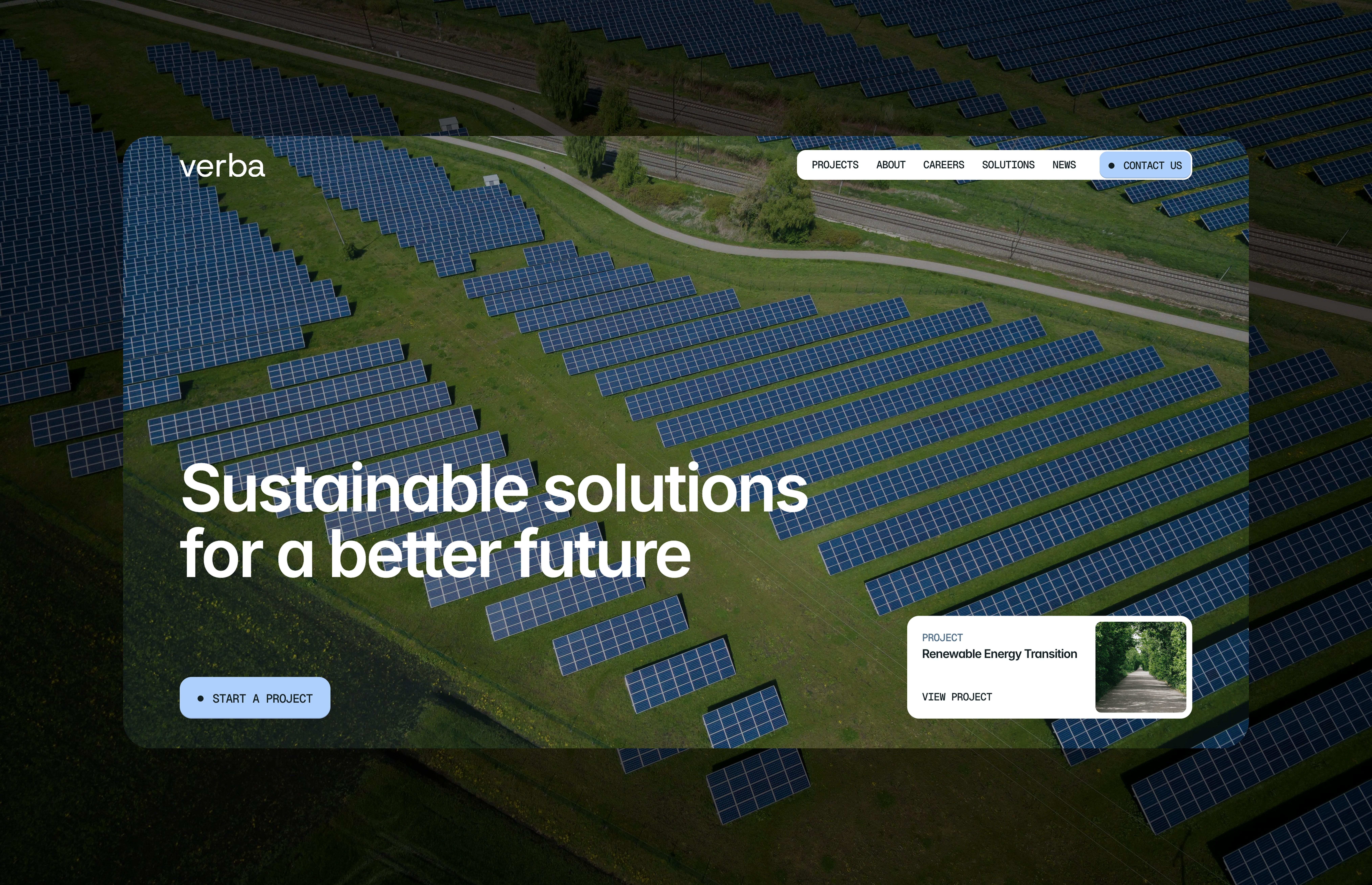
Brand identity and logo design for a European sustainability and clean-energy consultancy, built to read as credible to accreditation bodies and enterprise buyers alike.
Website Design & Development
Foundational Brand Identity
Know More
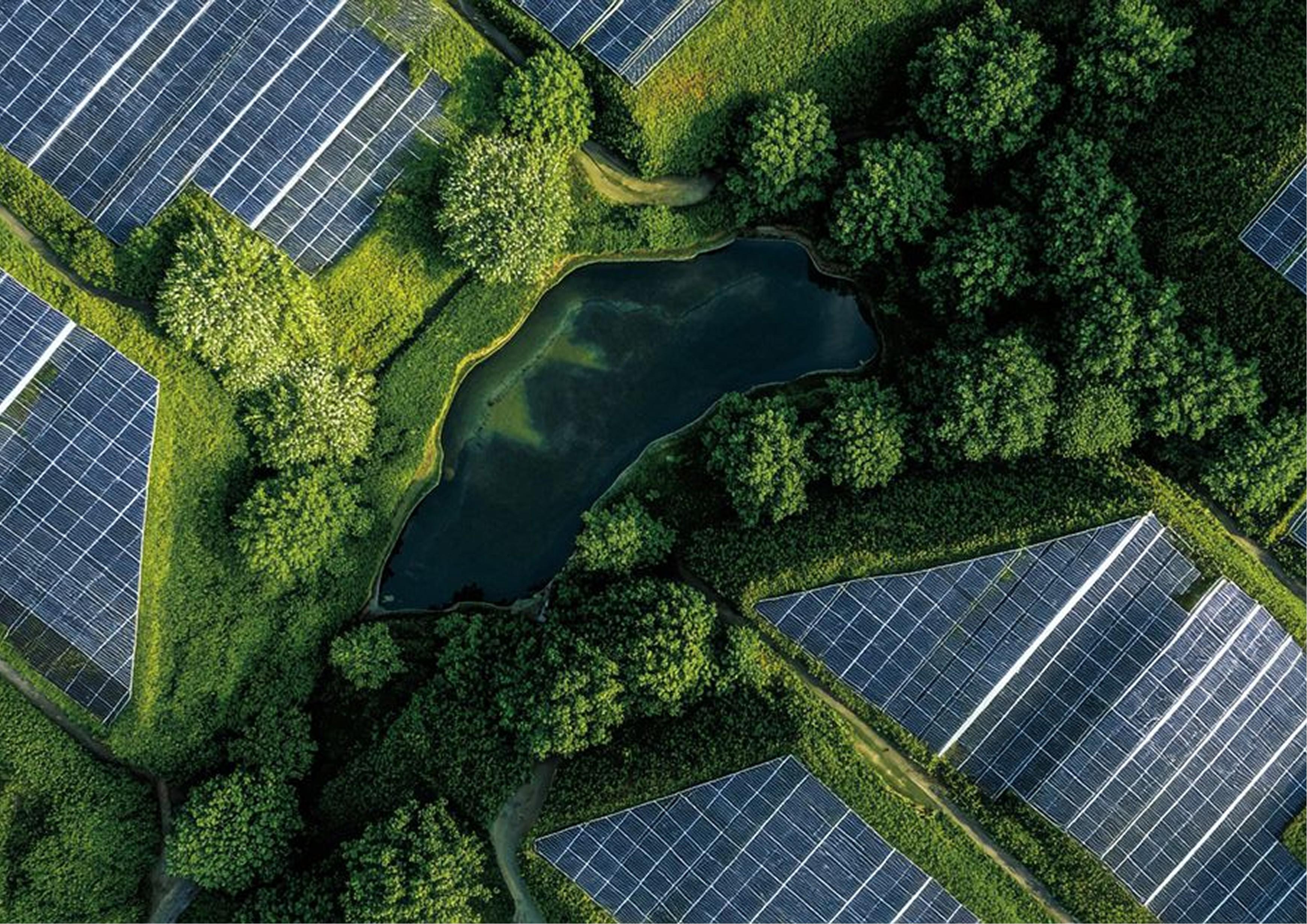
Inspired by the calm authority of the landscapes it exists to protect, this identity trades urgency and green-washing for the quiet credibility of an accreditation body.
Lena Kovač — Founder, Verba
"We needed a brand that could sit next to an ISO certificate without looking out of place, but still feel human. Nikel Digital Studio built us an identity our enterprise clients trust immediately — and that our own team is actually proud to put on a slide deck."
Problem
Many early-stage sustainability and clean-energy consultancies come to a web project with real technical credibility and literally nothing to design around.
It's a common gap in this niche: the expertise, the accreditations and the pitch deck exist long before there's budget or internal alignment for a full branding engagement. Tebra was exactly this case — no logo, no color palette, no photography, nothing beyond a name — and a full branding project wasn't something they could commission at that stage due to internal constraints. That left us with a real risk: build the site anyway on top of nothing, and ship something that looks and feels unfinished no matter how well the pages are built.
Solution
Rather than build a site with no visual foundation, we built a starter identity first — then the site on top of it.
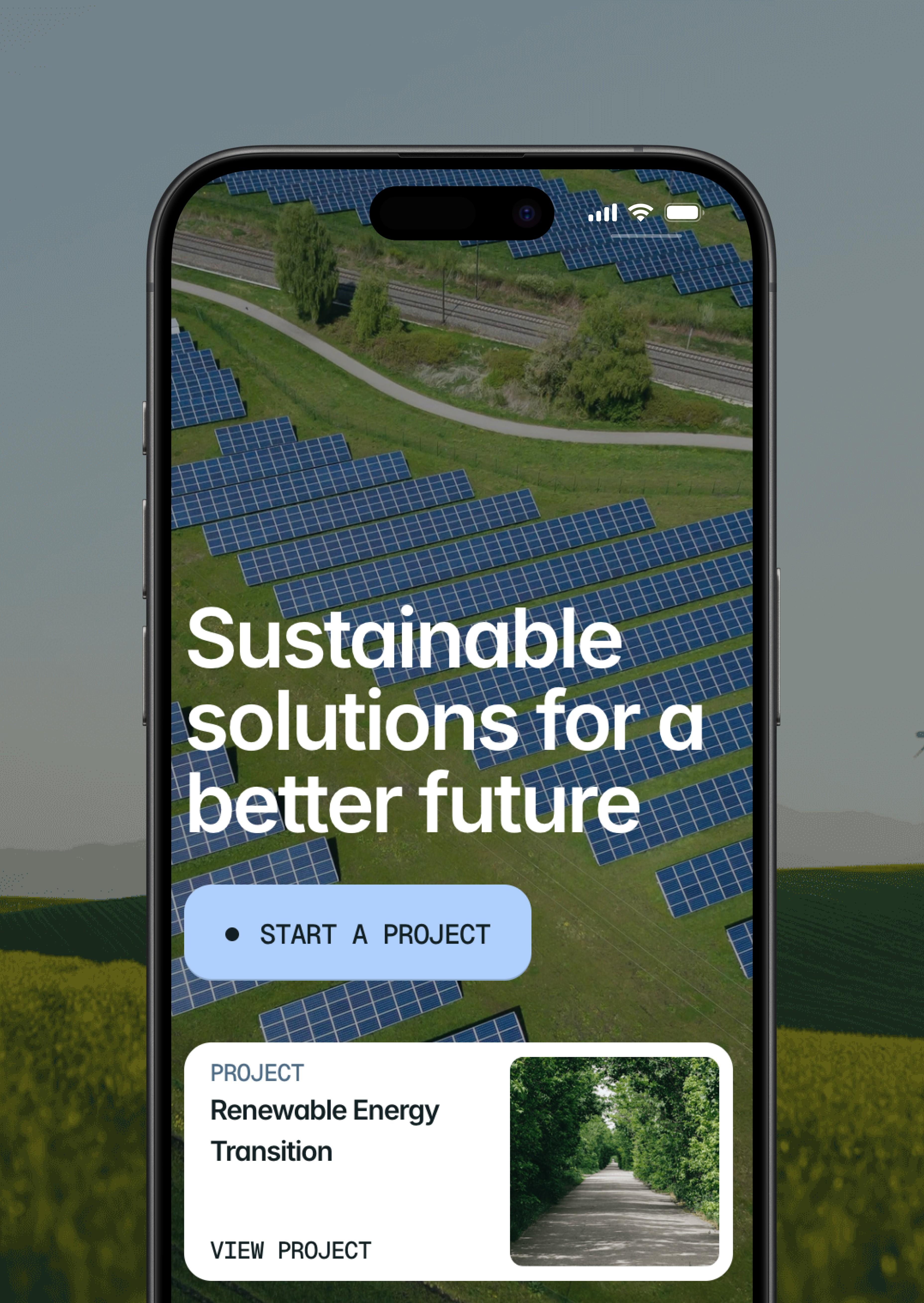
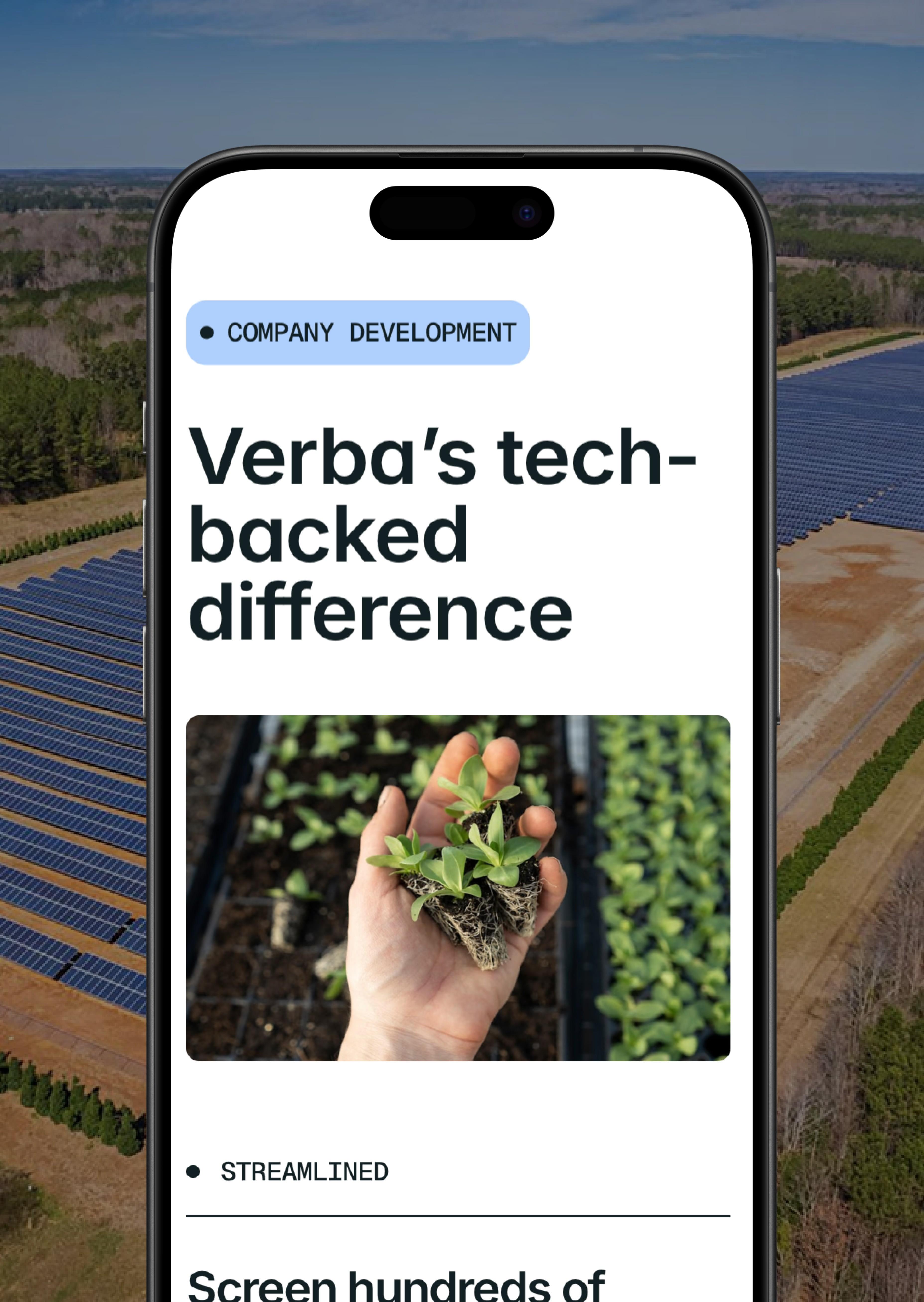
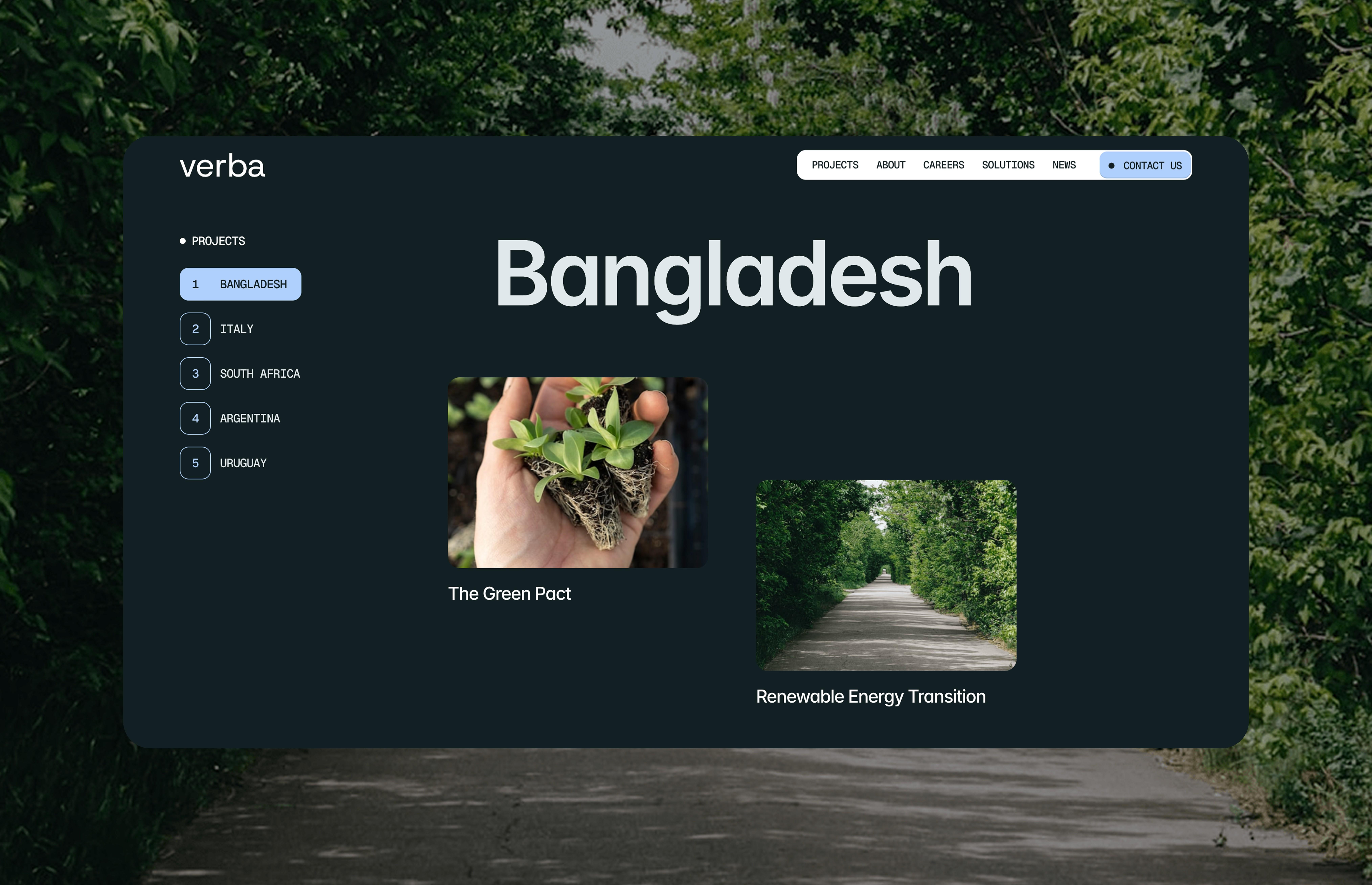
Since we don't ship a site without something coherent behind it, we treated this as two projects in one. First, a foundational identity: a simple, confident wordmark logo, a curated color palette, and a basic competitor/market scan to make sure the direction actually stood out in the sustainability space rather than repeating it. We then wrote creative briefs for photographers and organized on-site shoots at Verba's actual project locations, so the site would run on real photography instead of stock imagery. Only then did we build the full multi-page website — home, projects, about, solutions, careers, news, contact — on top of assets built to last, not placeholders for a "real" rebrand later.
Result
A "starter" identity that never got replaced — because it didn't need to be.
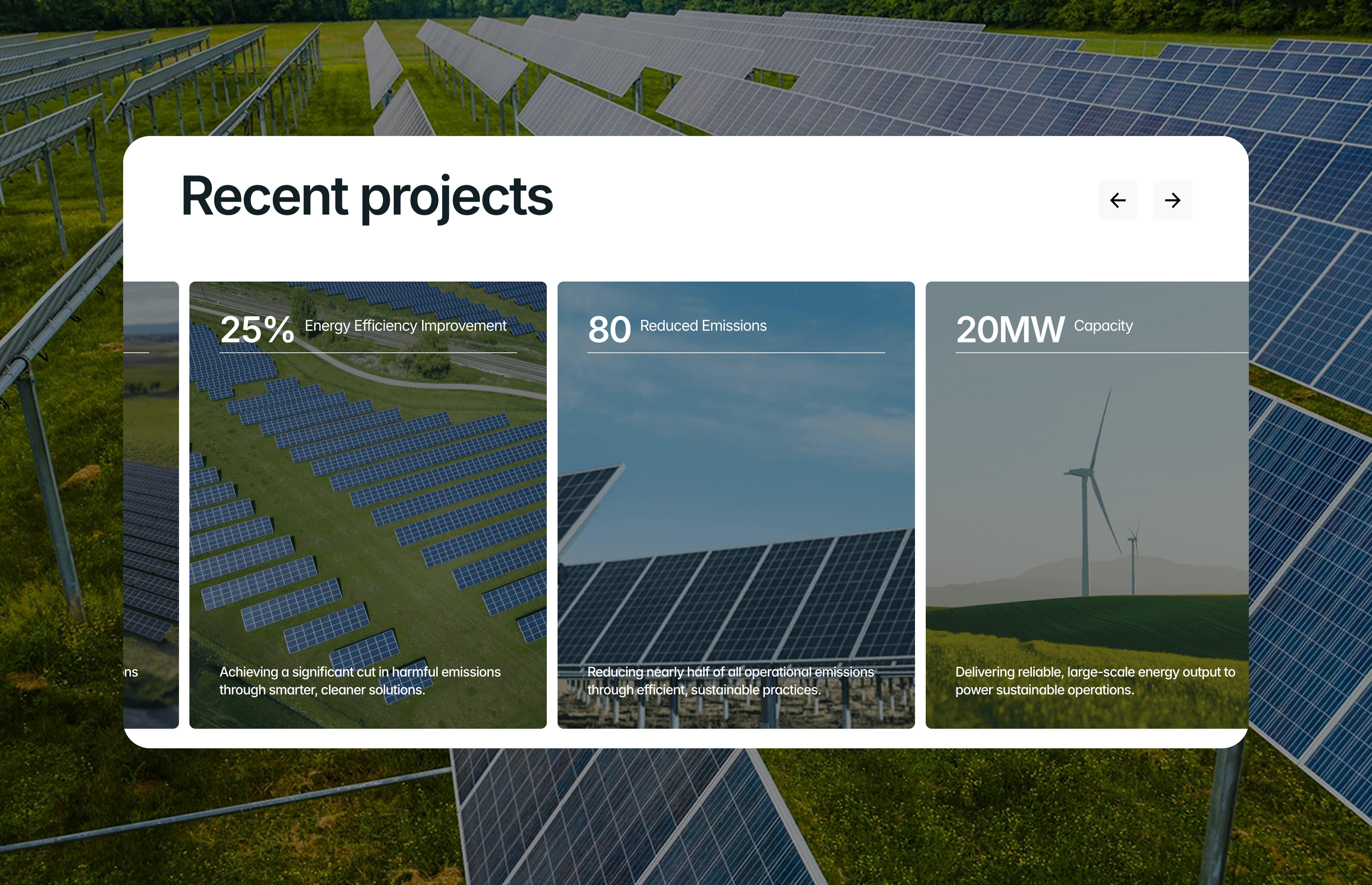
Years after launch, Verba is still using the same logo, color palette and typography across the website, social media and printed materials — what began as a starter identity became the brand's permanent visual system, without a formal rebrand ever being commissioned. The site itself drove a 30% increase in inbound partnership inquiries since launch, and the photography from our on-site shoots is still reused across the company's social channels and investor materials today.
Where AI helped
Site architecture & build — The seven-page structure (home, projects, solutions, about, careers, news, contact) was mapped and prototyped with AI-assisted layout tooling, then hand-built and refined by our dev team to hit the accreditation-grade polish the brand needed.
Technical SEO/GEO — Structured data and technical SEO were set up using AI-assisted research into how accreditation bodies and corporate buyers actually search — part of what drove the 30% rise in partnership inquiries after launch.
More Works
(GQ® — 02)
©2026
Verba
Brand identity and logo design for a European sustainability and clean-energy consultancy, built to read as credible to accreditation bodies and enterprise buyers alike.
Website Design & Development
Foundational Brand Identity
Know More
Inspired by the calm authority of the landscapes it exists to protect, this identity trades urgency and green-washing for the quiet credibility of an accreditation body.
Lena Kovač — Founder, Verba
"We needed a brand that could sit next to an ISO certificate without looking out of place, but still feel human. Nikel Digital Studio built us an identity our enterprise clients trust immediately — and that our own team is actually proud to put on a slide deck."
Problem
Many early-stage sustainability and clean-energy consultancies come to a web project with real technical credibility and literally nothing to design around.
It's a common gap in this niche: the expertise, the accreditations and the pitch deck exist long before there's budget or internal alignment for a full branding engagement. Tebra was exactly this case — no logo, no color palette, no photography, nothing beyond a name — and a full branding project wasn't something they could commission at that stage due to internal constraints. That left us with a real risk: build the site anyway on top of nothing, and ship something that looks and feels unfinished no matter how well the pages are built.
Solution
Rather than build a site with no visual foundation, we built a starter identity first — then the site on top of it.
Since we don't ship a site without something coherent behind it, we treated this as two projects in one. First, a foundational identity: a simple, confident wordmark logo, a curated color palette, and a basic competitor/market scan to make sure the direction actually stood out in the sustainability space rather than repeating it. We then wrote creative briefs for photographers and organized on-site shoots at Verba's actual project locations, so the site would run on real photography instead of stock imagery. Only then did we build the full multi-page website — home, projects, about, solutions, careers, news, contact — on top of assets built to last, not placeholders for a "real" rebrand later.
Result
A "starter" identity that never got replaced — because it didn't need to be.
Years after launch, Verba is still using the same logo, color palette and typography across the website, social media and printed materials — what began as a starter identity became the brand's permanent visual system, without a formal rebrand ever being commissioned. The site itself drove a 30% increase in inbound partnership inquiries since launch, and the photography from our on-site shoots is still reused across the company's social channels and investor materials today.
Where AI helped
Site architecture & build — The seven-page structure (home, projects, solutions, about, careers, news, contact) was mapped and prototyped with AI-assisted layout tooling, then hand-built and refined by our dev team to hit the accreditation-grade polish the brand needed.
Technical SEO/GEO — Structured data and technical SEO were set up using AI-assisted research into how accreditation bodies and corporate buyers actually search — part of what drove the 30% rise in partnership inquiries after launch.
More Works
(GQ® — 02)
©2026
Verba
Brand identity and logo design for a European sustainability and clean-energy consultancy, built to read as credible to accreditation bodies and enterprise buyers alike.
Website Design & Development
Foundational Brand Identity
Know More
Inspired by the calm authority of the landscapes it exists to protect, this identity trades urgency and green-washing for the quiet credibility of an accreditation body.
Lena Kovač — Founder, Verba
"We needed a brand that could sit next to an ISO certificate without looking out of place, but still feel human. Nikel Digital Studio built us an identity our enterprise clients trust immediately — and that our own team is actually proud to put on a slide deck."
Problem
Many early-stage sustainability and clean-energy consultancies come to a web project with real technical credibility and literally nothing to design around.
It's a common gap in this niche: the expertise, the accreditations and the pitch deck exist long before there's budget or internal alignment for a full branding engagement. Tebra was exactly this case — no logo, no color palette, no photography, nothing beyond a name — and a full branding project wasn't something they could commission at that stage due to internal constraints. That left us with a real risk: build the site anyway on top of nothing, and ship something that looks and feels unfinished no matter how well the pages are built.
Solution
Rather than build a site with no visual foundation, we built a starter identity first — then the site on top of it.
Since we don't ship a site without something coherent behind it, we treated this as two projects in one. First, a foundational identity: a simple, confident wordmark logo, a curated color palette, and a basic competitor/market scan to make sure the direction actually stood out in the sustainability space rather than repeating it. We then wrote creative briefs for photographers and organized on-site shoots at Verba's actual project locations, so the site would run on real photography instead of stock imagery. Only then did we build the full multi-page website — home, projects, about, solutions, careers, news, contact — on top of assets built to last, not placeholders for a "real" rebrand later.
Result
A "starter" identity that never got replaced — because it didn't need to be.
Years after launch, Verba is still using the same logo, color palette and typography across the website, social media and printed materials — what began as a starter identity became the brand's permanent visual system, without a formal rebrand ever being commissioned. The site itself drove a 30% increase in inbound partnership inquiries since launch, and the photography from our on-site shoots is still reused across the company's social channels and investor materials today.
Where AI helped
Site architecture & build — The seven-page structure (home, projects, solutions, about, careers, news, contact) was mapped and prototyped with AI-assisted layout tooling, then hand-built and refined by our dev team to hit the accreditation-grade polish the brand needed.
Technical SEO/GEO — Structured data and technical SEO were set up using AI-assisted research into how accreditation bodies and corporate buyers actually search — part of what drove the 30% rise in partnership inquiries after launch.
More Works
©2026